

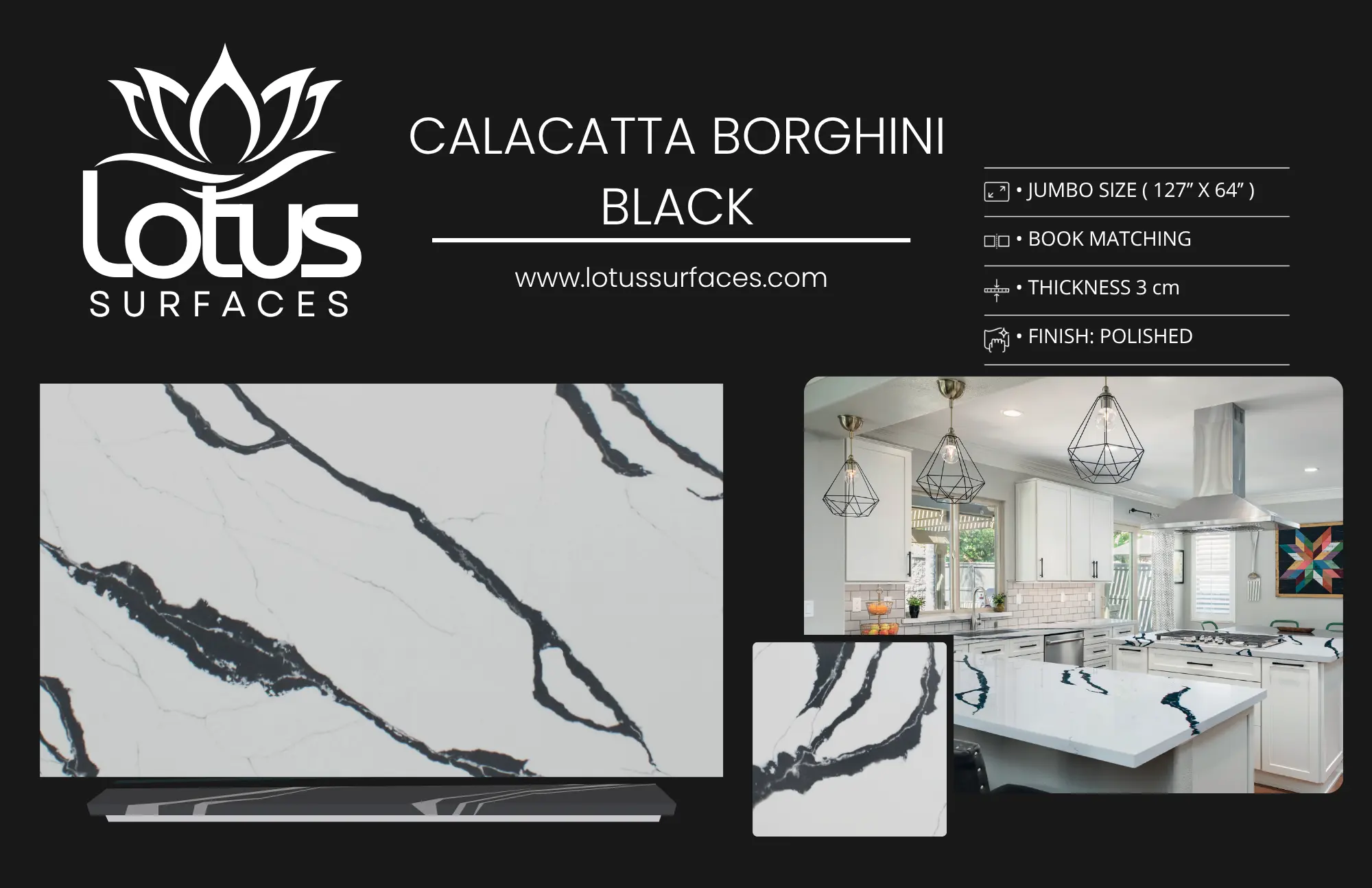
Mastering Countertop Contrast: Create Visual Depth in Kitchen Design
When designing a kitchen, one of the most impactful yet often overlooked elements is the use of countertop contrast. By strategically contrasting different countertop materials, colors, or textures, you can create a kitchen that is not only functional but also visually stunning. In this comprehensive guide, we will explore how to use countertop contrast to create visual depth in kitchen design, ensuring your space feels dynamic and inviting. Whether you’re considering quartz countertops in Norcross, GA, or granite fabricators in Atlanta, understanding the principles of contrast will elevate your kitchen design.
What Is Countertop Contrast?
Countertop contrast refers to the intentional use of different materials, colors, or textures to create visual interest and depth in a kitchen. This technique allows designers and homeowners to highlight specific areas, enhance the overall aesthetic, and improve the functionality of the kitchen space. By understanding how contrast works, you can make informed decisions that will significantly impact the look and feel of your kitchen.
The Importance of Contrast in Kitchen Design
Contrast plays a vital role in kitchen design for several reasons:
- Visual Appeal: A well-contrasted kitchen draws the eye and creates a sense of harmony. It can make the space feel more dynamic and engaging.
- Depth and Dimension: Using different countertop materials or colors can add depth to your kitchen, making it feel larger and more inviting.
- Highlighting Features: Contrast can be used to highlight specific features, such as an island or a backsplash, making them the focal point of the kitchen.
- Personal Expression: Countertop contrast allows homeowners to express their style and preferences, creating a unique kitchen that reflects their personality.
Types of Countertop Contrast
There are several ways to create contrast with countertops:
1. Color Contrast
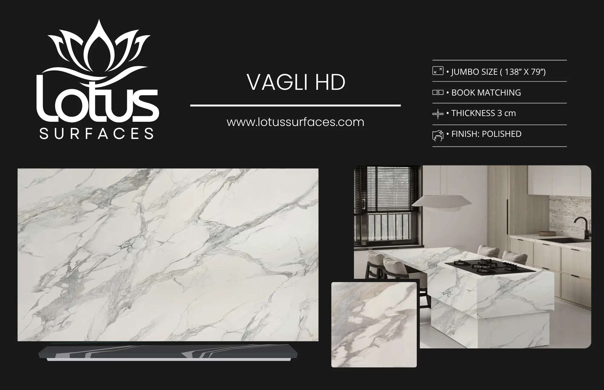
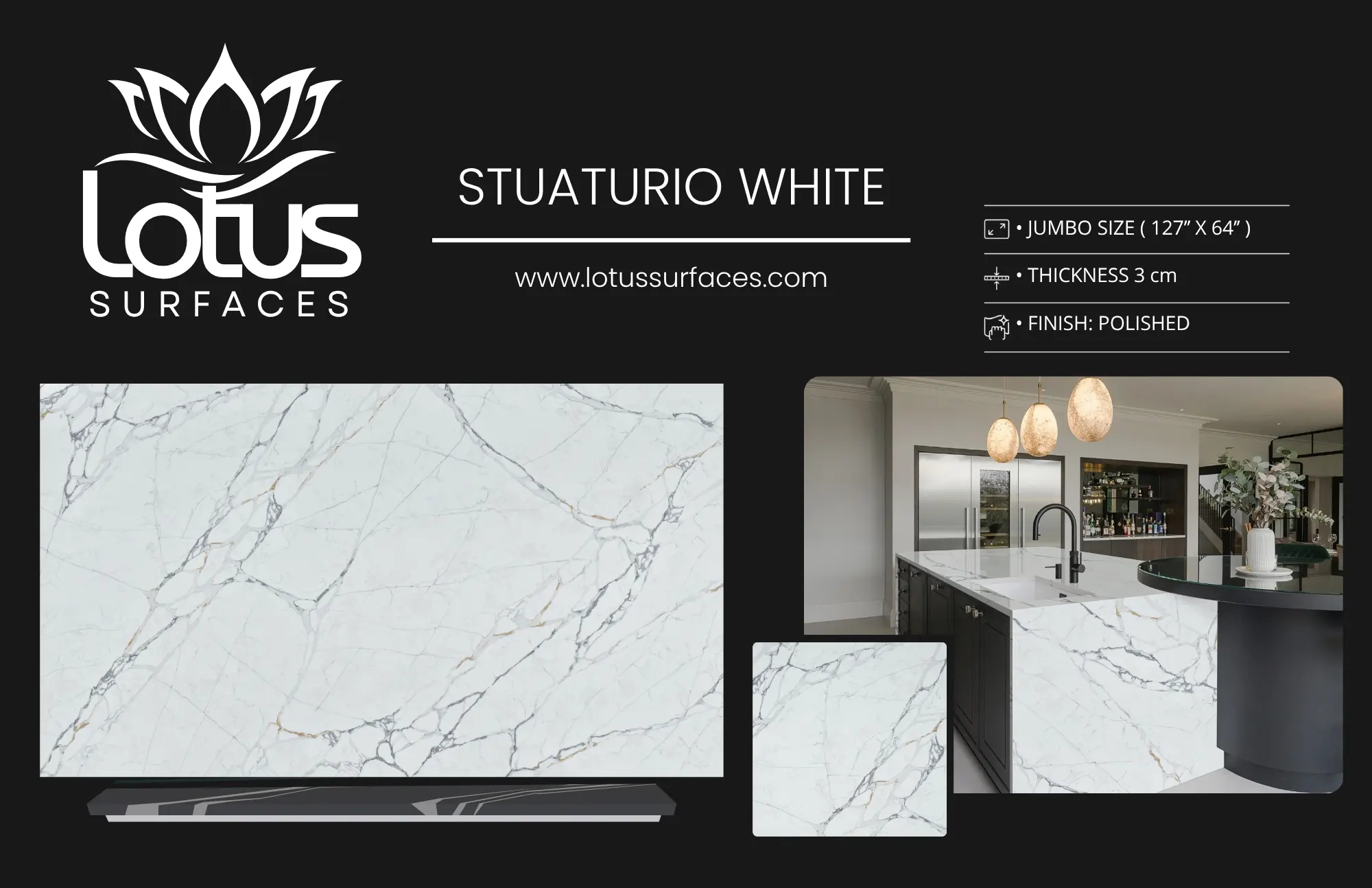
Color contrast is perhaps the most obvious way to create visual depth. By pairing light and dark colors or complementary colors, you can create a striking visual effect. For example, a white quartz countertop can beautifully contrast with dark wooden cabinets, creating a clean and modern look.
2. Material Contrast
Using different materials for your countertops can also add depth. For instance, combining granite with quartz or porcelain can create a stunning visual effect while also providing different functionalities. Each material has its unique properties, which can enhance the kitchen’s usability.
3. Texture Contrast
Texture contrast involves using smooth surfaces alongside textured materials. For example, a polished granite countertop can contrast beautifully with a rough-hewn wooden island. This combination not only adds visual interest but also creates a tactile experience.
4. Pattern Contrast
Patterns can also be used to create contrast. For instance, a countertop with a bold veining pattern can stand out against solid-colored cabinets, adding an element of sophistication.
Choosing the Right Materials
When selecting materials for your kitchen countertops, consider the following factors:
- Durability: Choose materials that can withstand daily wear and tear. Quartz, granite, and porcelain are excellent choices for their durability.
- Maintenance: Some materials require more maintenance than others. For instance, granite needs to be sealed regularly, while quartz is generally lower maintenance.
- Style: Consider the overall style of your kitchen. Modern kitchens may benefit from sleek quartz, while traditional kitchens may look great with warm-toned granite.
Creating Visual Depth with Color
Color is one of the most powerful tools in design. Here are some tips to effectively use color contrast in your kitchen:
1. Pairing Light and Dark Colors
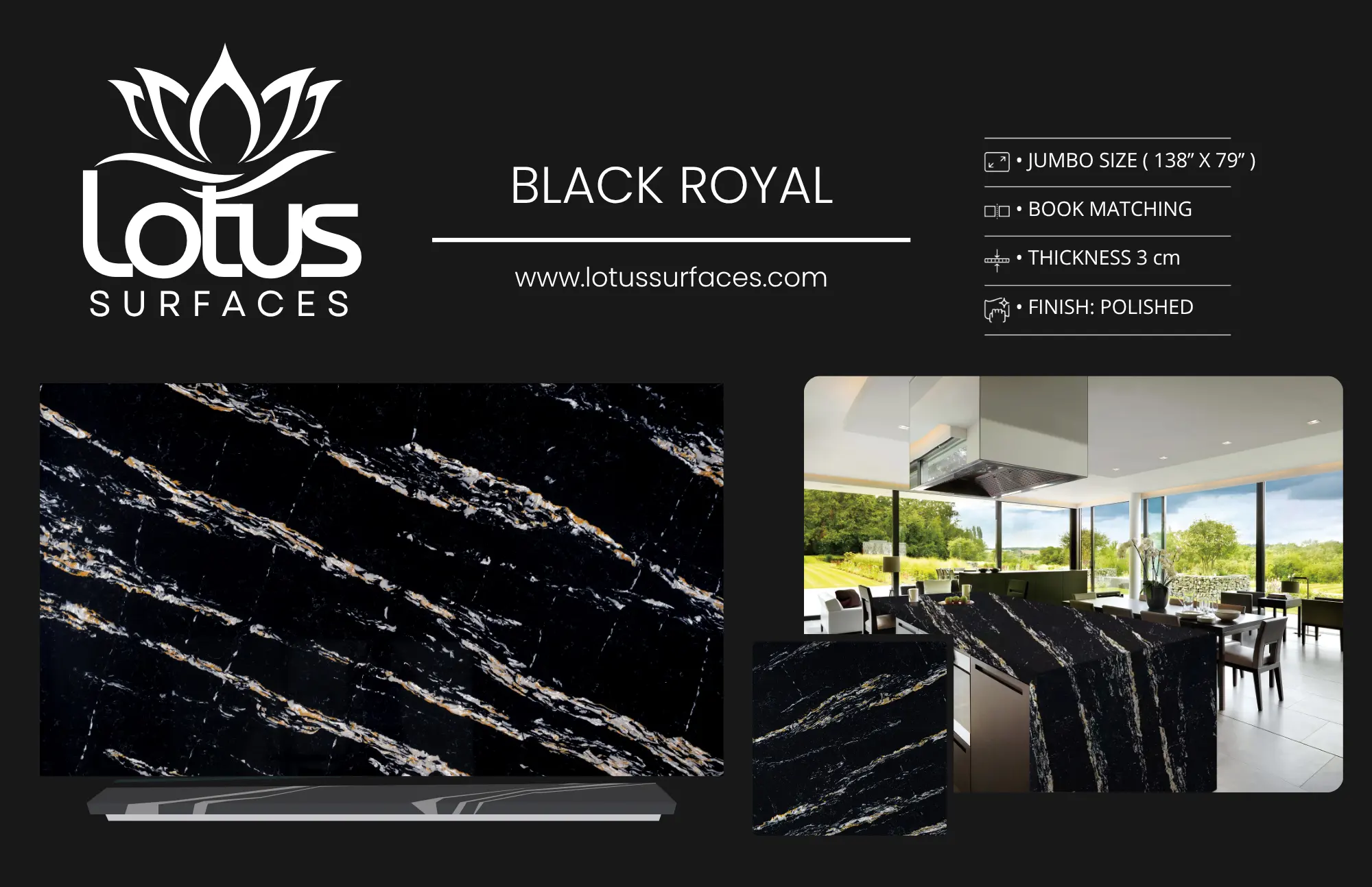
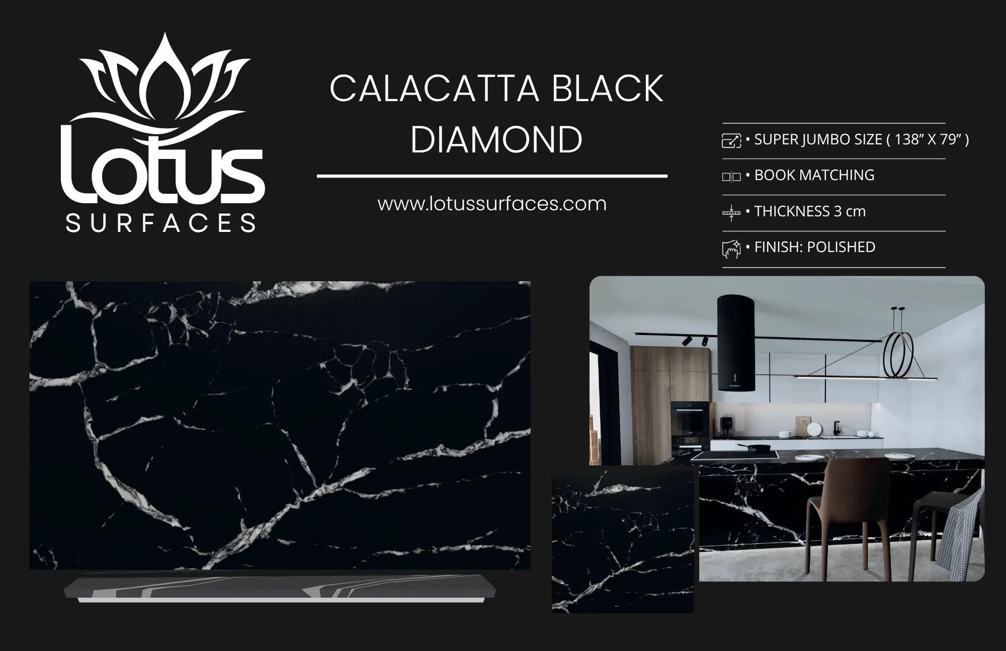
Using a combination of light and dark colors can create a dramatic effect. For example, pairing a dark granite countertop with white cabinets can make the kitchen feel more spacious while providing a striking contrast.
2. Using Complementary Colors
Complementary colors are opposite each other on the color wheel. For example, pairing blue and orange or red and green can create a vibrant and energetic kitchen. Use these colors in your countertops and cabinetry for a bold statement.
3. Accent Colors
Consider using accent colors in your countertops to draw attention to specific areas. For example, a bright-colored backsplash can complement a neutral countertop, adding a pop of color without overwhelming the space.
Texture and Pattern Contrast
Texture and pattern can significantly affect the visual depth of your kitchen. Here are some ways to incorporate these elements:
1. Combining Different Textures
Mixing textures can create a rich and inviting look. For instance, pairing a polished granite countertop with a textured wooden island can add depth and interest.
2. Layering Patterns
Layering patterns can also enhance visual depth. For instance, if you have a patterned backsplash, consider a solid countertop to balance the visual weight.
Expert Tips for Using Contrast Effectively
Here are some expert tips to help you use countertop contrast effectively in your kitchen design:
- Test Samples: Before making a final decision, always test samples of your chosen materials and colors in your kitchen’s lighting. This will give you a better idea of how they will look together.
- Balance is Key: While contrast is essential, too much can be overwhelming. Aim for a balanced approach that enhances the space without making it feel chaotic.
- Consult Professionals: If you’re unsure about your choices, consult with a professional kitchen designer or a local countertop fabricator in Atlanta. Their expertise can help you make the best decisions for your space.
FAQ
What is countertop contrast?
Countertop contrast refers to the intentional use of different materials, colors, or textures to create visual interest and depth in a kitchen.
Why is contrast important in kitchen design?
Contrast enhances visual appeal, creates depth, highlights features, and allows for personal expression in kitchen design.
What types of contrast can be used in kitchen countertops?
Color contrast, material contrast, texture contrast, and pattern contrast are all effective ways to create visual depth.
How do I choose the right materials for my countertops?
Consider durability, maintenance, and style when choosing materials for your kitchen countertops.
Can color contrast make my kitchen look bigger?
Yes, using light and dark color contrasts can create the illusion of a larger space.
What are some expert tips for using contrast in kitchen design?
Test samples, maintain balance, and consult professionals for the best results.
How does texture contrast enhance visual depth?
Mixing different textures creates a rich and inviting look, adding depth and interest to the kitchen.
Where can I find high-quality countertops in Atlanta?
Lotus Surfaces offers a wide selection of premium countertops and professional guidance for homeowners in the Greater Atlanta area.
Conclusion
Incorporating countertop contrast into your kitchen design is a powerful way to create visual depth and enhance the overall aesthetic of your space. By understanding the various types of contrast and how to effectively use them, you can transform your kitchen into a beautiful and functional area that reflects your personal style. Whether you choose quartz countertops in Norcross or granite fabricators in Atlanta, remember to consider the balance and harmony of your design choices. For expert assistance and a wide selection of countertop materials, contact Lotus Surfaces today.
